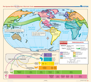
IMMIGRANTS SINCE 1970
Map on spring roller with backboard
Color-shaded arrows show immigration from seven different regions (Africa, Australia and Oceania, Asia, northern and western Europe, North America, South America, and eastern and southern Europe), with the thickness of each arrow representing the relative number of immigrants coming from that region (the thicker the arrow, the greater the number of immigrants). Countries that had more than 500,000 immigrants are boldfaced and in capital letters; countries with less than 500,000 are regular type and in title case. The bottom part of the map shows the number of immigrants that came to the United States from specific countries within each region.
This title is part of the series: THE NYSTROM COMPLETE U.S. HISTORY MAP SET

